
The challenge of data
As power and propulsion engineers, we do not lack for data. Designs of new components are built on the learning obtained from the data of the past. This data is obtained from engines operating in the field, from development programmes, from final designs and candidate designs, from machines operating at design condition and off-design conditions, from data published by competitors, from our own research programmes and from collaborative and government-funded research. The origins of some of this data stretch back to the first half of the 20th century, but the rate at which new data is accumulated has never been greater than it is today. This influx of data is driven by the remarkable exponential growth in compute capability, and also by a surge in our ability to instrument the manufacturing, operation and maintenance of our products. The challenge we face is not, primarily, one of obtaining data, it is in making the best use of the data we have.
The primary focus of the present discussion is data from computational simulations, though the principles have wider applicability. The NASA CFD Vision 2030 report, Slotnick et al. (2014), provides useful signposts and recommendations for the development of future computational capabilities in the aerospace sector. In the design and analysis of components, engineers can deploy the continued growth of compute capability in two ways: large numbers of production fidelity simulations (designated as “capacity” computing); or, small numbers of large computational domain, high fidelity simulations (“capability” computing). Design of a new component typically involves capacity computing to explore the design space, with some capability computing to assess the final design at a higher fidelity. The author’s view is that developments in our data visualisation capabilities have focussed on the analysis of single computations, varying the full range of size from capacity to capability compute, and not on the tools needed to work easily with large numbers of simulations. As the NASA Vision 2030 report put it (with italics added by the present author),
Meeting this challenge will require a step change in our simulation workflows and processes. By “large ensemble”, we could easily mean thousands or tens of thousands of computations. We need ways to work with these simulations as they are produced, both in their own context and also in relation to legacy computations and measurement data. Our current visualisation and analysis tools were not designed for this task.Goal, scope and layout of the paper
The challenge of interacting with large ensembles of data is not unique to the work of power and propulsion engineers. An ecosystem of software tools enables online e-commerce sites, for example, to provide us with groceries, books and travel arrangements. Considering the latter, for a moment: when we start thinking of a trip, we might go to our favourite travel website and ask what options are available between two destinations on a given day; we would then filter by time of departure, by trip duration, by carrier, perhaps even by mode of transportation; having narrowed the search down to a manageable selection, we would then look at the details of each of the options. This process of seeing a high level description of a large database, then interactively narrowing down our search, and finally looking at a small selection of data in detail is the same for the very different applications of online travel site and power and propulsion analysis.
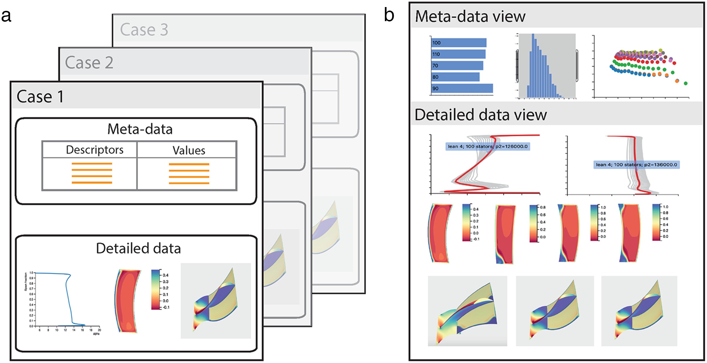
Figure 1 shows a conceptual view of the server-client abstraction for the analysis of a collection of computational simulations or measurement data. The data is stored on a server, Figure 1a, with each case being characterised by a series of high level descriptors (“meta-data”), and detailed, lower level data such as line, contour and surface plots. On the client, just as when we access an e-commerce website, the high level descriptors can be interactively filtered until we obtain a subset of cases of interest. The detailed data is then transferred to the client, where comparative plots are visualised for further analysis.
Figure 1.
Hierarchical and dynamic database visualisation: storage of cases (meta-data and detailed data) on the server, and interactive visualisation on the client. (a) Server - each case contains meta-data and detailed data. (b) Client - database is filtered using the meta-data, selected cases are viewed in detail.
An interactive approach to working with large ensembles of computational or experimental data would not only enable a different way of visualising our data, it would also enable an individual to ask questions of both current and legacy data, and hence derive new learning. Perhaps the greatest impact would be in the way a team interacts with data. Instead of an individual presenting a fixed series of slides, the group would now have the ability to collaborate using a dynamic, interactive view of the data and quantitative answers could be provided to questions as they are raised (not days later in a re-convened meeting); many of these questions may not have been thought of by the original presenter and hence not be addressed in pre-prepared slides. This would not only speed up the rate at which understanding is derived, it is also likely, through better harnessing of the capabilities of the team, to reach conclusions that an individual working alone could not.
The aim of this work is to demonstrate a hierarchical and dynamic approach to making use of our data. A web-based model is proposed whereby the user filters a database of results by interactively selecting values and ranges for high level descriptors. A subset of the database can then be examined in detail. The paper begins by emphasising that this hierarchical approach (high level, then detailed) is inherent to the design process and is well-understood by engineers. The importance of dynamic, interactive representations of data, so that we may undertake virtual experiments, as a key route to deriving learning is then explained. This leads to a strategy for visualising large ensembles of data and the embodiment of this approach in the open source tool, dbslice. Three example applications of dbslice are then presented: visualisation of a database of compressor stator designs; the use of a machine learning classifier to aid database navigation; and visualisation of unsteady data from a large eddy simulation. The paper concludes with an outlook for future developments.
Engineering, design and data
Engineers have always been skilled at simplifying complex problems and the conventional design process reflects this. Following the specification of a product, a large number of concepts are conceived and evaluated before detailed design is undertaken on a small number of candidates. Even at the conceptual design stage, the engineer works with underlying principles, and transferrable knowledge from both personal and community experience, to explore the design space using a limited palette of high level parameters such as machine size, operating point, etc. As the design proceeds, the number of dimensions of the design space is increased, ultimately allowing the detailed embodiment of the product to be defined and analysed.
As the dimensions of the design space increase, so does the amount of data associated with the design. The final design is detailed enough to allow the parts of the machine to be manufactured and assembled. The performance of the resultant machine, as captured by high level metrics such as power output, turbine entry temperature or efficiency, should be consistent with those values used at the initial conceptual design stage. There often exists a formal process to transform a large number of high fidelity (“low level”) data points into a reduced number of low fidelity (“high level”) data. For example, the propulsion and power engineer routinely works with average quantities (averaged over a region in space and/or period of time) to reduce the dimensionality of data. This mapping of different fidelities of data, of changing its dimensionality as we move up and down the hierarchy of data from high level to low level is the daily workflow of an engineer. If we move to a situation with a “large ensemble” of simulations, as envisaged by the NASA Vision 2030 report, the challenge is different in terms of degree (we have introduced one or more new dimensions) but is of the same kind.
How do we learn from data?
In developing a visualisation system to help make the best use of our available data, at all levels of fidelity, we need to understand how we learn from data. There are many theories of learning and two that align with our experience as engineers are those of Kolb (1984) and Bruner (1966). We will use the example of lift from an airfoil in a wind tunnel to discuss these.
Kolb’s experiential learning cycle, Kolb (1984), has four phases: experience - we test the airfoil in the wind tunnel and measure the lift as we change the angle of attack; reflect on our observations - perhaps the lift peaks and then drops at a lower angle of attack than we were expecting; abstract - what has happened to our airfoil? how can we extend the non-stalled range?; plan our next test - we decide to fit vortex generators to our model as a way of promoting attached flow. We then return to the experience phase to try our new design. This learning cycle resonates with us as engineers, whether we are testing in the physical world or running simulations in the virtual world; we are familiar with this cycle as the iterative process through which designs are improved.
Bruner (1966) proposed that ideas are represented and understood in three ways: the enactive representation means that an individual experiences the idea - such as by feeling the lift generated on the airfoil in the wind tunnel; in the iconic representation, the idea is captured in a diagram or picture - for example, a picture of the streamlines as they separate from the airfoil; and the symbolic representation communicates an idea using written words or equations - the words on this page or the functional representation of lift coefficient.
There is a linkage between Bruner’s representation of ideas and Kolb’s experiential learning cycle. Both theories emphasise the importance of experiencing the concepts. In the context of learning from data, this means being able to interact with the data by creating dynamic representations. If we can make a change to some input parameter and see the iconic representation of the data react in real time (think of the streamlines moving as we adjust angle of attack) then we feel as though we are conducting our own experiment, and the data representation is somewhat enactive, at least in a virtual sense. If we are able to reflect on this, and plan and rapidly create a new visualisation, then we are taking part in Kolb’s experiential learning cycle.
Victor (2014a) explores ways in which current and future technology should be used to convey ideas, and support creativity, in his lecture, “The Humane Representation of Thought”. Victor emphasises the power of interactivity and dynamic representations. He also goes further than the present project by noting that working with data on a screen, albeit dynamic and interactive, is not making full use of Bruner’s enactive channel. Victor envisages rooms where the data supports and responds to the physical activities of the participant. In our example, the engineer could sculpt a new (real) airfoil, see the resultant flow (virtual), and quantify the resultant lift. This concept would transform the way we work with data from our current “flat panel of glass” to a much more physically active experience.
In his lecture, Victor notes that, with respect to learning from complex models, “dynamic trumps everything”. Since the 1990’s, engineering visualisation software has recognised the benefits to data exploration that interactivity brings. Visual3, Haimes and Giles (1991), Darmofal and Haimes (1992) and Haimes (1994), was a pioneering tool in this regard. Visual3 used hardware acceleration to simultaneously render a 3D (full domain) and 2D (cut plane) view of a steady or unsteady CFD simulation. The software was developed with interactivity as a core requirement. Streamlines, vector tufts, iso-surfaces and cut-planes could all be interactively initiated and manipulated. There are a number of excellent visualisation packages, Ahrens et al. (2005), intelligent light (2020) and tecplot (2020), that allow engineers to analyse single computations by creating a dynamic, interactive environment. In the next section, we develop a strategy for employing the concepts of Kolb, Bruner and Victor to large ensembles of data.
A strategy for visualising large ensembles of data
The goal is a visualisation tool that allows the engineer to work with, and learn from, large ensembles (thousands) of simulations or measurement data. The strategy for delivering this objective is comprised of three pillars.
Hierarchical data
We cannot visualise the details of thousands of simulations at once. Instead, we can make use of our engineering design process approach of a hierarchy of data, from high level problem specification to low level detailed analysis. We can navigate a database of high level metrics (these could be inputs such as design parameters and flow coefficient, or outputs such as loss coefficient and efficiency) and, by filtering and sorting, select a subset of simulations for low level inspection (of the three-dimensional flow field, for example).
Dynamic visualisations
The user must be an active participant in the visualisation process. The plots should be dynamic and interactively respond to the user’s experimentation. In this way, the user participates in the experiential learning cycle, Kolb (1984), and the data is represented using both the Iconic, and, virtually, Enactive channels, Bruner (1966). The goal is to allow the engineer: to identify connections between inputs (design parameters) and outputs (flow field structures and performance metrics); to categorise the simulation cases into groupings with similar behaviour; and to distill the large ensemble of cases into a small number of transferrable descriptions (observations, low order models) that will guide future designs, simulations or experiments.
Accessible and portable
The requirement to use both new and legacy data naturally suggests a client-server model. The server is the repository for the data, and the client is the location where the interactive visualisation takes place. In this work, a web-based approach has been adopted and this offers two principal advantages: first, there is a large and evolving ecosystem of software for web-based data processing; and second, a browser-based client is portable across all platforms - workstation, laptop, tablet and phone.
Implementation in dbslice
dbslice, Pullan et al. (2019), is a web-based interactive visualisation client for analysing large ensembles of data. The visualisation process is conceptually divided into two steps: meta-data visualisation, and detailed data visualisation.
Meta-data visualisation
High level descriptors, meta-data, of each simulation or experimental case are transferred from the server to the client when dbslice is started. These could include inputs such as operating point, design parameters or simulation type, and outputs such as machine performance metrics. The meta-data is considered as a table with each row as a different case and each column a different input or output value (number or string).
The plots used for meta-data visualisation, Figure 2, are interactive and dynamically connected. This allows the user to navigate the database of simulations by selecting meta-data value ranges using a histogram, for example, or categories using a bar chart. Every time such a filter is adjusted, all the other meta-data plots respond to show which cases comply with the current filter settings. This functionality is built on the d3, Bostock (2020) and crossfilter (2020) JavaScript libraries.
Figure 2.
Plot types used for the meta-data visualisation step, Pullan and Li (2018). (a) bar chart. (b) histogram. (c) scatter.
By visualising the meta-data in this way, the user is able to experience the connection between input and output values, and to identify which groups of cases have similar behaviour. A second goal is to apply multiple filters to determine a subset of cases for deeper scrutiny in the detailed visualisation step.
Detailed data visualisation
Once a subset of cases has been determined, the user requests that detailed data on these cases is transferred from the server to the client. “Detailed data” is typically any data associated with a case that cannot be represented by a single value (number or string). One-dimensional arrays (line plots) and two-dimensional arrays (contour plots or three-dimensional surface plots) are common instances of detailed data, Figure 3. In the meta-data visualisation, all of the cases in the database are represented in each plot. In the visualisation of detailed data there are two options: either all the cases meeting the criteria of the current filter settings are represented in one plot (for example, a line from each case drawn on the same pair of axes); or, each case is given its own plot (for example, a contour map for each case).
Figure 3.
Plot types used for the detailed visualisation step, Pullan and Li (2018). (a) line. (b) contour. (c) surface.
Case highlighting
The meta-data and detailed plots are linked using interactive case highlighting. When the user touches (a real touch on a tablet or other touchscreen device, or a mouse event on a desktop computer) a line representing a case in a detailed data plot, the same case is highlighted in the meta-data plots and also in corresponding representations in the other detailed data views. Case highlighting is two-way in that touching a case in a meta-data plot (a scatter plot, for example) will highlight all associated detailed data plots.
Data formats
dbslice accepts common formats of tabulated data for the meta-data (such as csv and json files). A challenge when reading the information required for the detailed data plots is that there is no single format that has been widely adopted; as well as files, data may also be transferred to dbslice via an API to an online repository or database. To enable the required flexibility, dbslice allows conversion filters to be provided, as JavaScript code, to map the available format to the internal structures of dbslice. If a conversion filter is not an efficient strategy, the user can also add their own plot functions to dbslice so as to handle the new formats directly. An example of this is the UK river levels demonstration, Pullan and Li (2018), where the real-time depth data at selected measurement stations (chosen using meta-data filters on catchment area and river name) is accessed from a remote service using an API and then plotted (as detailed data) in dbslice.
Applications of dbslice
In this section, three examples are given of use cases for dbslice. The first example is a blade design study where a collection of 590 three-dimensional steady Reynolds-Averaged Navier-Stokes (RANS) simulations of a stator blade (as part of a 1.5 stage simlation) are examined to understand which designs have best performance and to form linkages between design parameters, operating point and performance. The second example is the same database of solutions, but now a machine learning approach has been used, on the server, to automatically classify the simulations according to whether a corner separation is present. The final example is from a single Large Eddy Simulation (of transonic flow passed a turbine trailing edge); in this case, the ensemble is a set of snapshots from the computations, rather than a set of separate computations. In each example, emphasis is placed on the benefits of a hierarchical (meta-data then detailed data) and dynamic (interactive database filtering and detailed plot analysis) visualisation workflow.
Ensemble of simulations for blade design
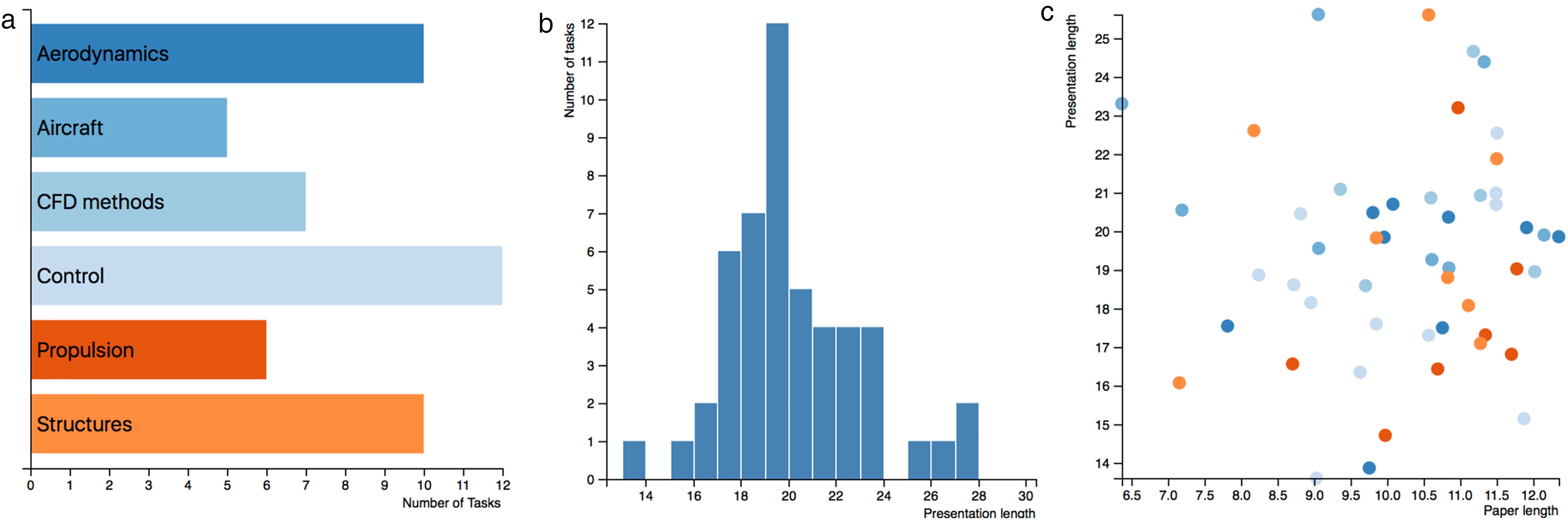
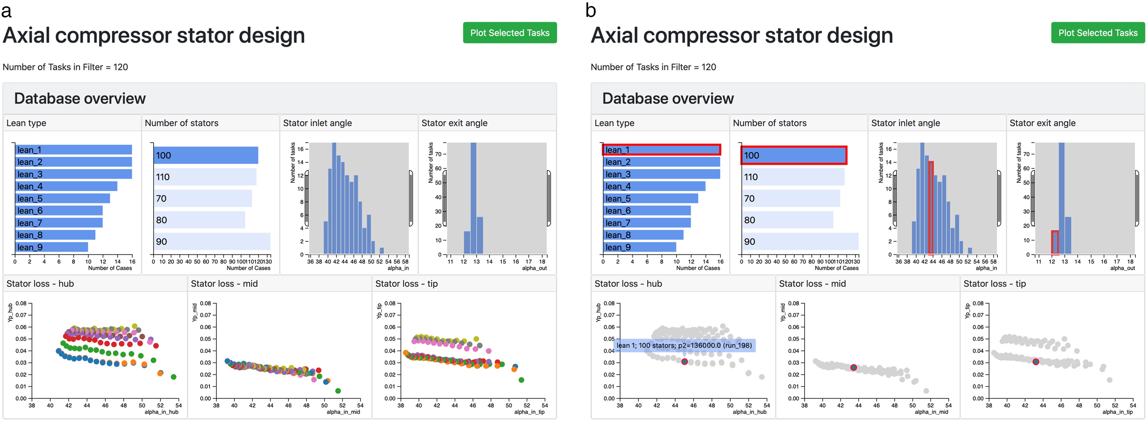
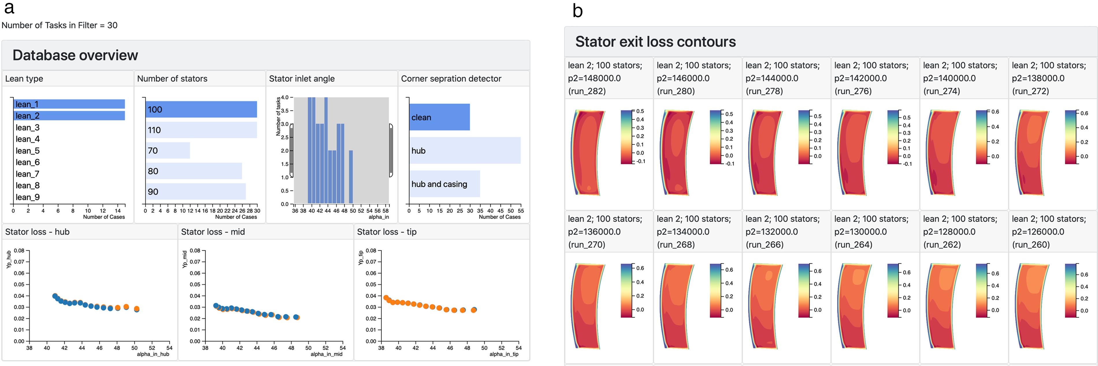
The meta-data from a collection of 590 three-dimensional steady RANS simulations (called “tasks” in dbslice) of an axial compressor is shown in Figure 4. Each simulation is of the flow through a 1.5 stage machine and the design of the middle row, the stator, is of interest. The meta-data describing the simulations contains both input and output parameters. There are two input parameters in Figure 4: stator lean type - 9 different three-dimensional stacking philosophies have been tried, from bowed pressure-side toward the endwalls, to straight stacked, to bowed suction-side toward the endwalls; and the number of stators in the simulation. The five output parameters in Figure 4 are: inlet and exit stator flow angles, and stator loss coefficient, in the hub (0–30% span), mid (30% to 70% span) and tip (70% to 100% span) regions.
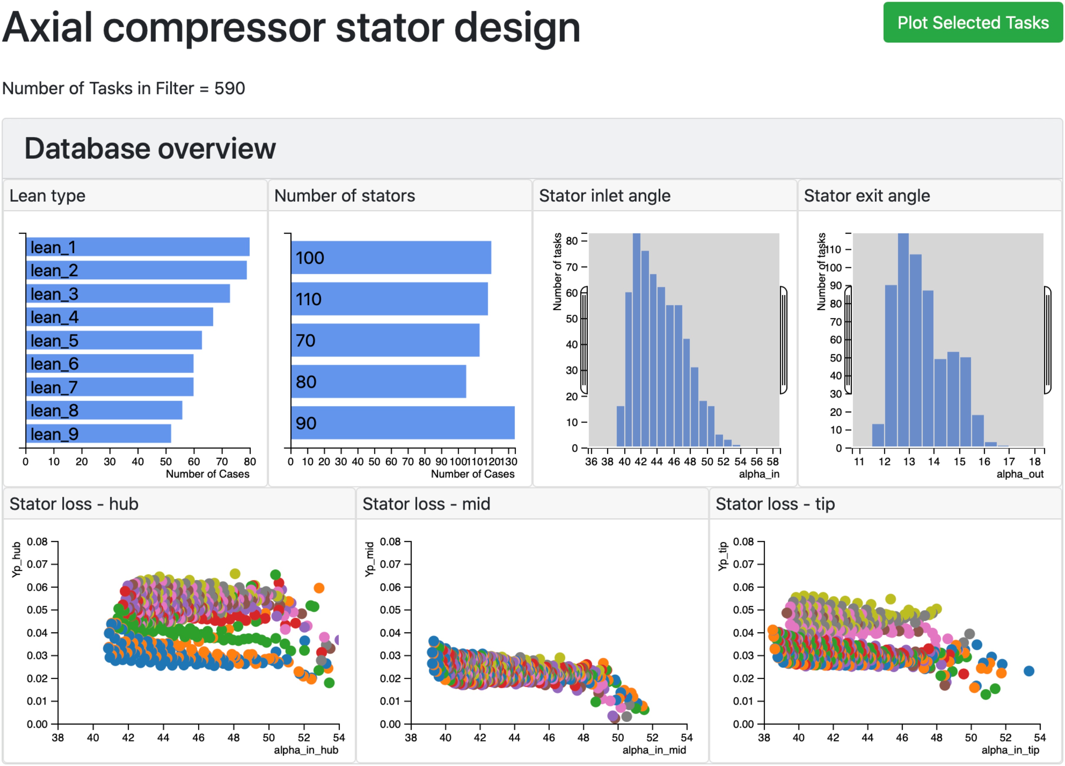
The view of the database in Figure 4 is dynamic in that the user can touch the bars on the “Lean type” and “Number of stators” charts, or adjust the ranges in the histograms showing the inlet and exit flow angles, and the database is interactively filtered. As an example, only the cases with 100 stators are shown in Figure 5a and the number of cases (“tasks”) in the filter has dropped from 590 to 120. The individual cases shown in the scatter plots are also responsive. When the user touches any of the points in a scatter plot, Figure 5b, all the data corresponding to this case are highlighted in the other meta-data plots (bar charts, histograms and scatter plots); this allows the user to observe connections between input parameters such as lean type and number of stators, and the performance of the stator in each of the hub, mid and tip regions.
Figure 5.
Interactive filtering of the database. (a) By selecting cases with 100 stator blades, the database is filtered to 120 simulations. (b) When one case is touched in the “stator loss - hub” plot, the same case is highlighted in all other plots.
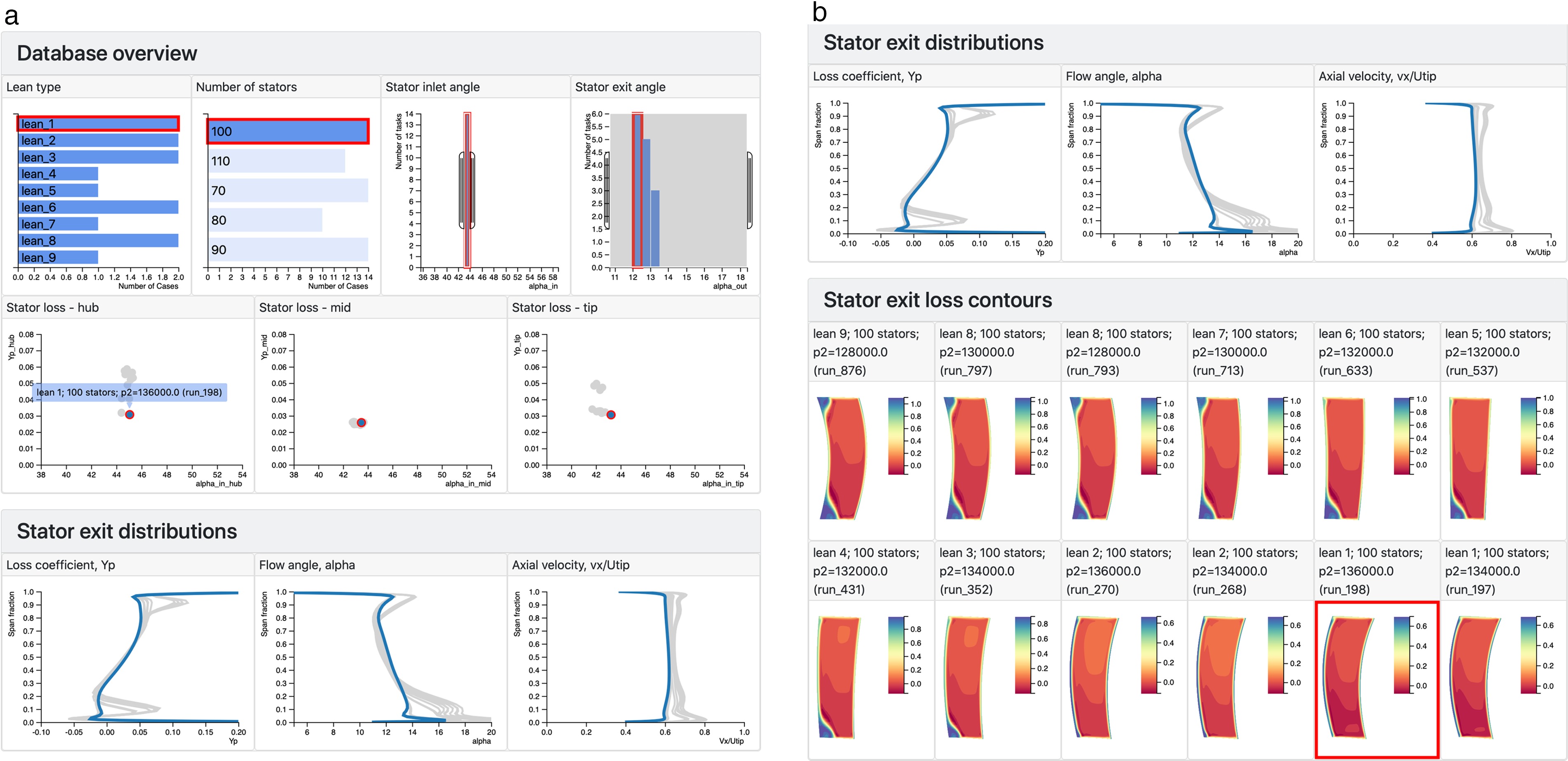
Once the engineer has spent some time working with the meta-data in Figures 4 and 5, it will become apparent that the choice of lean has a powerful effect on the stator performance, particularly in the hub and tip regions. To examine this, a subset of the 100 stator cases is obtained by selecting the stator inlet angle range of 43–44 degrees. This reduces the number of tasks in the filter to about a dozen cases. Detailed plots are now requested from the server, and the web browser adds line plots of span-wise distributions at stator exit, contour plots of loss at the stator exit plane, and 3-D views of the stator blade and exit flow. Figure 6 shows examples of this detailed data. In Figure 6a, the engineer has touched the lowest hub loss design, and this highlights that the design also has good mid and tip region performance, with smoothly varying exit distributions that do not exhibit the endwall loss and deviation of many of the other designs (touching the different lines will also highlight the corresponding scatter points, contour plots and meta-data information). In Figure 6b, the stator exit contours show the presence of endwall corner separations in several designs but the design selected in Figure 6a results in a flow with a clean wake.
Figure 6.
The data set is now filtered down to 10 cases by selecting simulations with 100 stator blades and a narrow range of stator inlet angles. (a) The user touches one case in the “stator loss - hub” plot and the span-wise exit distributions corresponding to the same case are highlighted. (b) The stator outlet flow contours show corner separations in many of the simulations, our case of interest is highlighted by dbslice.
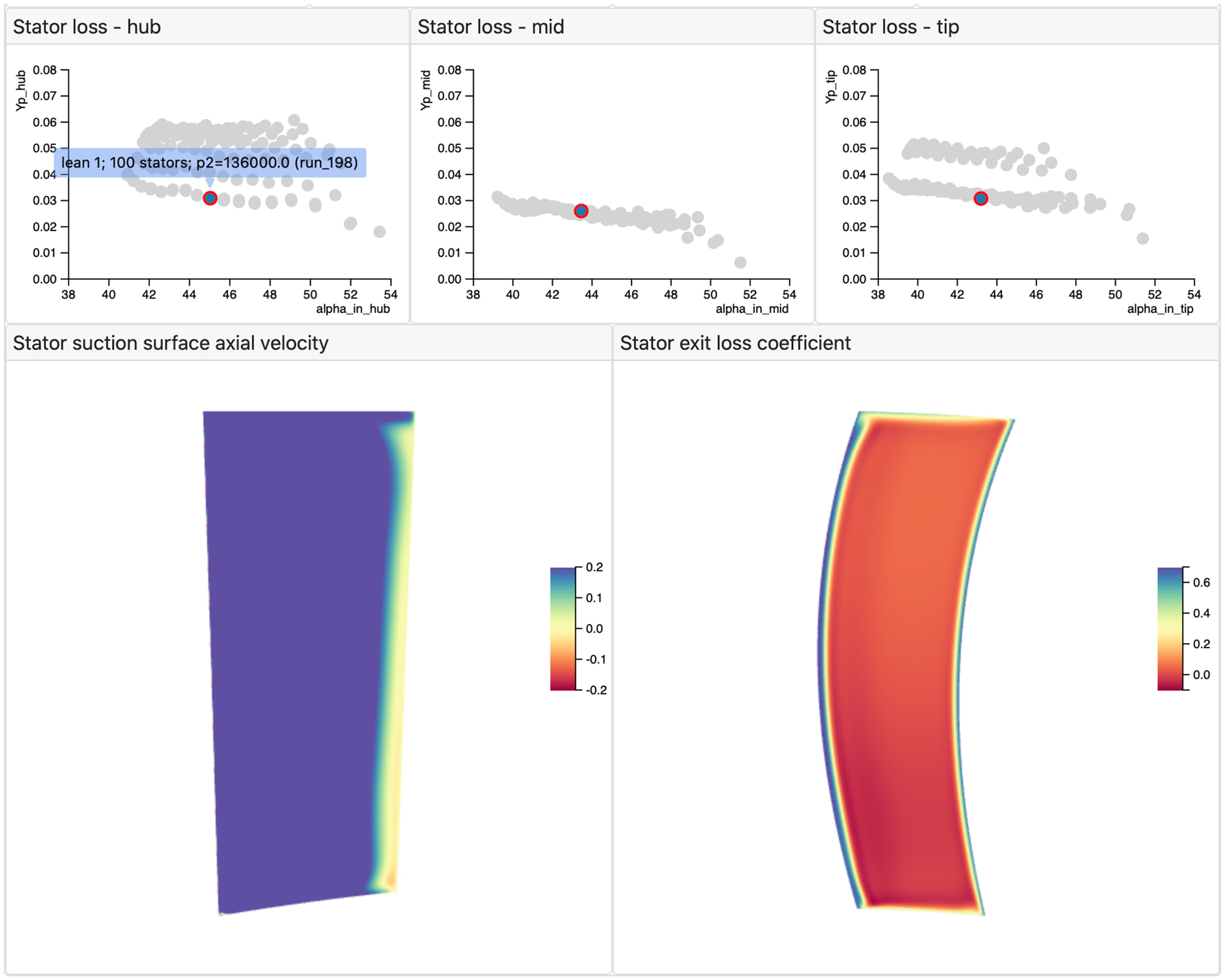
Since each contour plot is shown separately in Figure 6b, a large number of cases in the filter will result in a “wall of contours” which is challenging to navigate and extract learning from. An alternative is to only show contours for the current highlighted case, Figure 7. Now as the user touches different points in the scatter plots (or lines in the exit distributions, etc), the corresponding contour plots are automatically displayed. By storing the contour data on the server in the native format for WebGL hardware acceleration (binary buffers), no intermediate processing is required on the client and the user experience remains interactive. The contours shown are axial velocity close to the suction surface (left) and stator exit loss coefficient (right) - again the behaviour of the highlighted case is satisfactory.
Figure 7.
Dynamic contour plots. Each time a different case selected, the corresponding contour plots are immediately displayed.
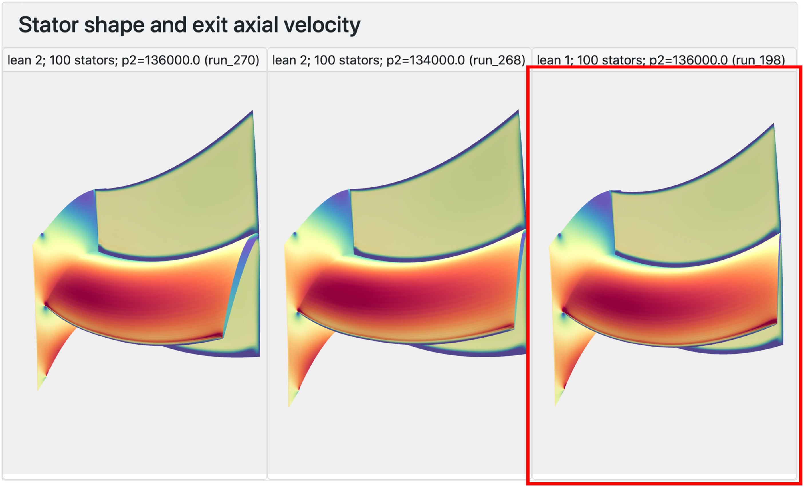
WebGL allows the kind of rendering of 3-D objects in web browsers, even on mobile devices such as phones and tablets, that was once only possible using expensive workstations. In Figure 8, interactive 3-D views of three of the stator designs are shown, and our chosen design is highlighted. Here, the pressure-side toward the endwall bow of the “lean_1” stacking philosophy is clearly visible. The engineer could also use this type of plot to see that “lean_9” bowing (the opposite sense) promotes the formation of corner separations.
Figure 8.
3-D interactive views of the stator blades, rendered using WebGL. The views shown are looking downstream from upstream of the blade; the blade is horizontal with the leading edge and suction-surface visible. The hub endwall and a downstream cut plane are also shown.
Figures 4–8 are one possible journey through this database of compressor stator designs; it is likely that no two engineers would take quite the same path as they explore, and learn from, the simulations. The hierarchical and dynamic process also encourages a more collaborative approach (as compared to a traditional slide deck) to group presentations and discussion. Many questions raised in such a process can be answered quickly with the available data.
Using machine learning to aid database navigation
In the compressor design study of the previous example, the engineer was able to correlate the stator performance metrics to the type of lean used. The principal source of loss, endwall corner separations, was also identified and connected to the lean employed. Once a database of results has been assembled, it is also possible to use machine learning techniques to identify patterns within the database, Pullan et al. (2019). As an example of this, a neural network was developed and run on the server in order to “tag” computations with a clean stator wake, a hub corner separation or a casing corner separation.
The network used is an example of a convolutional neural network (CNN) image classifier. The architecture of the CNN is shown schematically in Figure 9. The input to the neural network is the stator outlet loss contours, downsampled on to a 28 × 28 grid. In a CNN, each convolution layer sweeps a kernel (analogous to a stencil operation in numerical analysis) over the data from the preceding layer. In our case, the result for an individual output point from a convolution layer is obtained by applying a local 5 × 5 stencil to the corresponding input data. By training the CNN on a set of flow fields (with known clean wakes or corner separations), the weights of the kernels (coefficients of the stencil) in each convolution layer are optimised to allow the CNN to detect corner separations in unseen data. The full CNN shown in Figure 9 also employs data reduction layers (known as “pooling”) and Fully Connected layers, see Pullan et al. (2019) for more details.
Figure 9.
Schematic of the convolutional neural network used to identify corner separations in the database of compressor stator simulations.

The CNN was trained using artificially generated images of wakes, Figure 10. No simulations were performed, but representations of the flow field were synthesised using wake thickness, angle and separation size parameters. A set of 10,000 such images were used to train the CNN, which was then found to correctly identify the presence of corner separations in a separate set of 1,000 test images (also artificially generated) with over 99% accuracy. When applied to the database of compressor stator simulation, the CNN correctly classified the type of stator outlet flow field in all but one of the 590 cases.
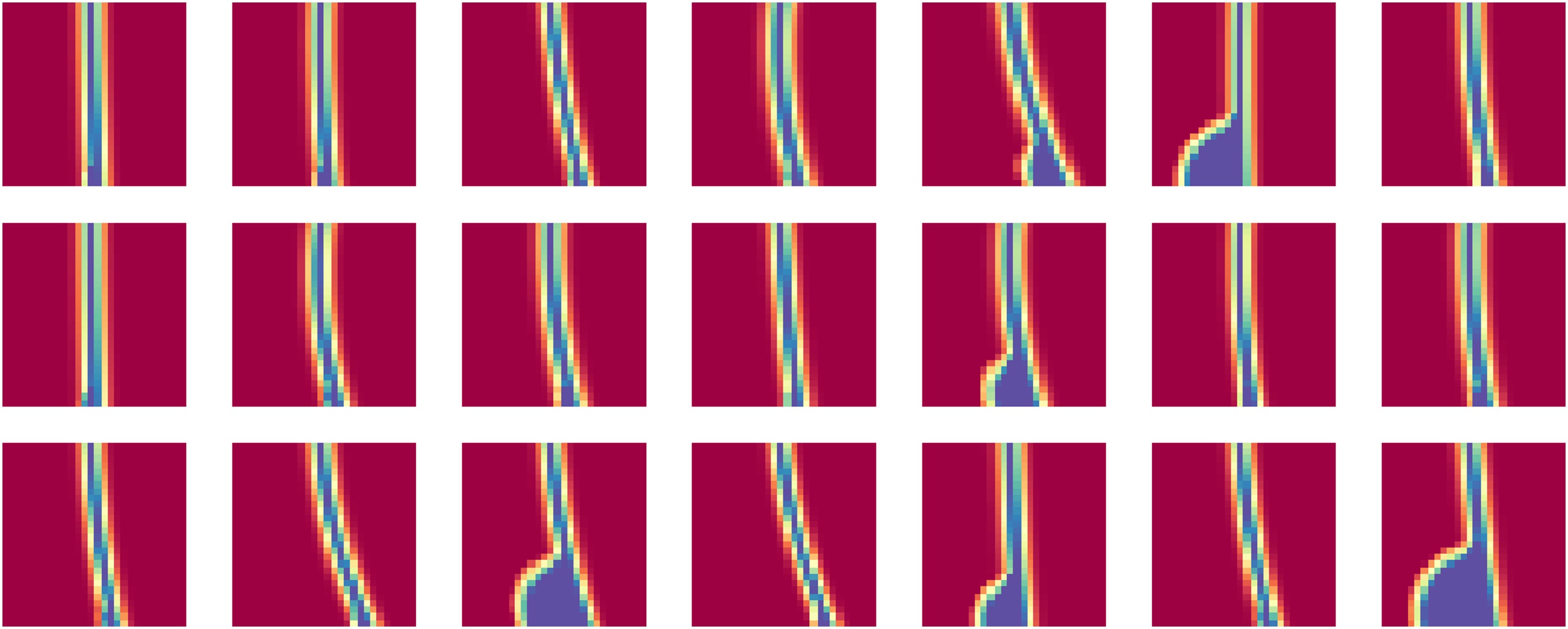
The CNN is used to tag the cases in the database with either “clean” wake, “hub” separation, “casing” separation, or “hub and casing” separation. Figure 11 shows a view of the resulting database in dbslice. In Figure 11a, the engineer has filtered the data to show only clean wakes, for the cases with 100 stators. It is immediately apparent that only Lean types 1 and 2 have clean wakes, and Figure 11b, with a sample of these outlet flow fields, shows that the CNN has correctly classified the simulations shown.
Figure 11.
Compressor stator designs database, with CNN-derived corner separation classification added to the meta-data. (a) By selecting “clean” wakes (and 100 stator blades) the connection with lean types 1 and 2 is immediately apparent. (b) A selection of the simulations with “clean” wakes, as identified by the CNN.
The use of a visualisation tool such as dbslice necessitates a structured approach to archiving data on a server. Collecting simulation data in this way means that techniques such as the CNN employed here can be readily tested and deployed on exiting datasets, with the results added to the meta-data for engineers to use in future analyses.
Ensemble of snapshots from unsteady simulations
The dynamic representation tools used in dbslice can be applied to unsteady as well as steady simulations. In Figure 12, the collection of data is a series of snapshots from a Large Eddy Simulation of the flow past an isolated turbine trailing edge; the trailing edge is part of a single airfoil that is located in a duct with profiled walls (visible at the top and bottom of the contour plot in Figure 12). Each contour plot comprises over 1 million triangles, and there are 50 snapshots in the database. By touching the points in the base pressure versus time scatter plot, the Mach number contour plot is automatically updated, using the same functionality as that used to create the dynamic plots in Figure 7.
Figure 12.
Using dbslice to show an ensemble of 50 snapshots from an LES simulation. The time step responds interactively the selection of points in the base pressure plot (left), and the contour plot and line plot are updated. The cut line shown in the contour plot can be dragged and the line plot updates.
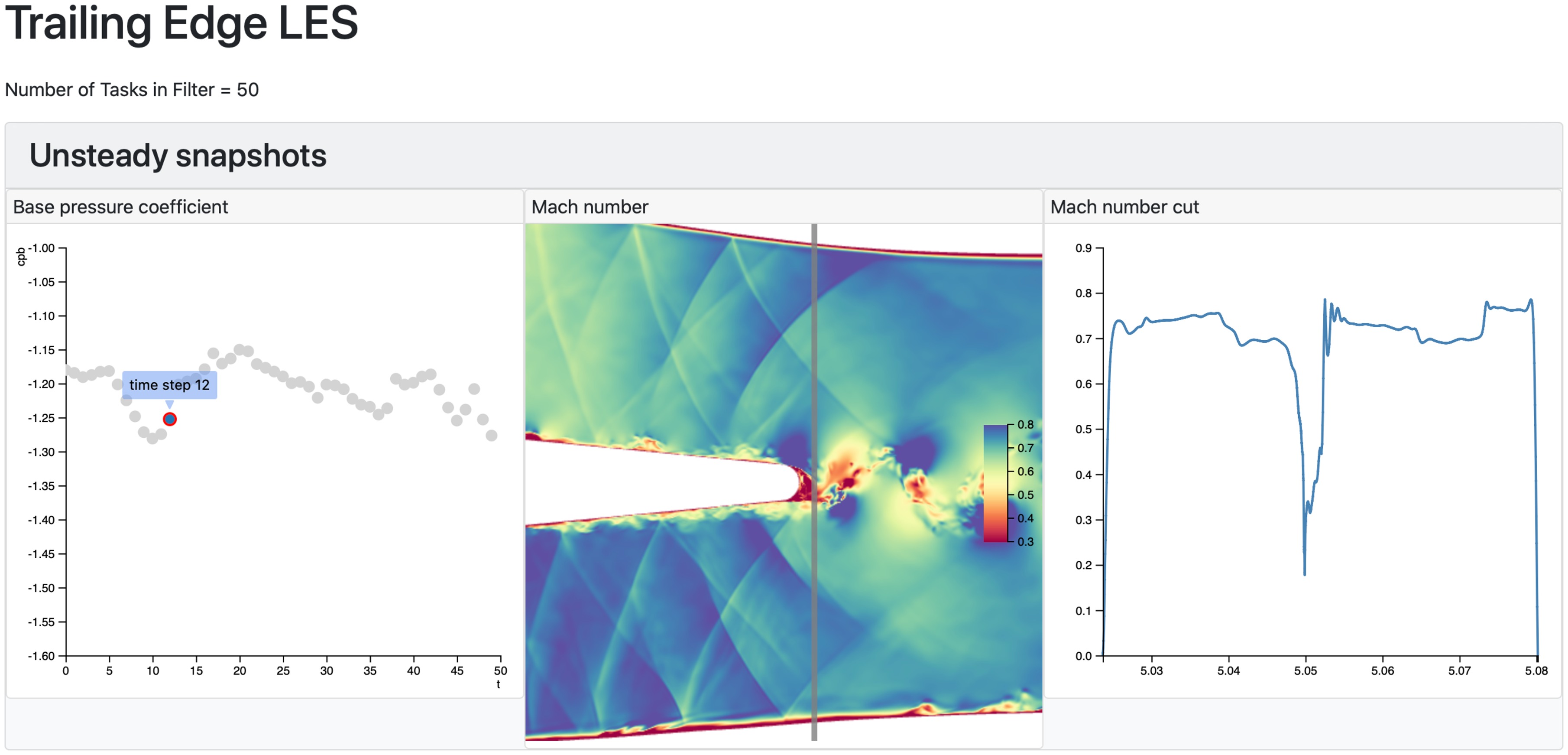
Figure 12 also shows a cut through the Mach number contours, just downstream of the trailing edge, at the location indicated by the vertical line on the contour plot. The location of the cut can be dragged by the user and the cut immediately updates, as it does when the snapshot is changed. The cut is performed using a two-dimensional version of the well-known Marching Cubes method of iso-surface generation. In this example, this “marching triangles” algorithm is performed on the client (in the web browser). In order to maintain an interactive user experience, dbslice performs some pre-processing such that each cut can be rapidly generated. The speed of the marching triangles algorithm can be greatly accelerated by not having to search every triangle in the domain each time a new cut is requested. To avoid this, the full unstructured grid is traversed once, on start up, and the minimum and maximum x coordinate for each triangle is stored. These
This example has shown how results from a single LES computation can be explored in the browser. The contour plot in Figure 12 is comprised of 1.4 million triangles. Operations such as cut plane extraction from ensembles of simulations of this size is likely to be too memory and compute intensive for a web client such as dbslice. Instead, such processing is likely to move to the server where data from multiple cases can be extracted in parallel before sending to the client for rendering.
Outlook
It is a challenge to convey the experience of working with dynamic visualisations using the static medium of this paper. All the demonstrations presented here are available, interactively, at the dbslice web site dbslice (2020). Even if the representations themselves are dynamic, we are used to the experience of working with data on computer screens as being a sedentary one - we are typically sitting down, just moving our fingers on a mouse. If we want to increase our participation in working with the data so as to make it a more enactive experience, then we can create visualisation rooms - “seeing spaces” Victor (2014b) - where different parts of an interactive wall show views of different databases and our understanding is aided by human-scale spatial, as well as dynamic, representations.
Much of the work presented in this paper has focussed on visualising databases of computational simulations, but the themes of hierarchical data and dynamic representations have broad applicability. We have demonstrated dbslice using ensembles of results generated during a particular study (design of compressor stator; application of machine learning to a design study; visualisation of unsteady data) but a powerful benefit to the learning process comes from combining a number of studies with legacy data. Returning to our blade design example, the database could also include the design studies for blading of recent products, unsteady simulations of selected blades, experimental data from development engines and research programmes, and also the output of correlations embedding in the company’s processes (and, perhaps, the data these correlations are based on). With this survey of current and historic data, the engineer can not only evaluate the latest design in the context of comparable predecessors, but the boundaries of the company’s design space experience can be located, and the applicability of correlations tested. As the power and propulsion industry responds to the challenges of decarbonising the sector, the ability to explore new design spaces quickly, and learn from that exploration, is of critical importance.
Conclusions
Power and propulsion engineers are faced with the challenge of making the best use of an ever-increasing volume of data. A visualisation process based on two pillars is developed:
hierarchical data - Engineers are used to working with hierarchical data: high level specifications and performance metrics, low level detailed design data. Visualisation of large ensembles of data can make use of this by allowing the engineer to dynamically filter the full database of results using high level descriptors, before examining the detailed data of a subset of the available cases.
dynamic representations of data - The learning process is accelerated by experimentation. By making the representations of our data responsive and interactive, engineers can discover linkages between input parameters, output metrics and physical mechanisms.
A web-based implementation of these concepts, dbslice, has been demonstrated on three applications: aerodynamic design study for a compressor stator; application of machine learning to aid navigation of large databases; visualisation of database of snapshots from an unsteady simulation. In describing these examples, the process of interactively discovering connections in the data by moving from high level “meta-data” to low level detailed visualisations has been emphasised.
The demonstrations presented have all used computational simulations, but the visualisation framework also applies to databases of experimental data, measurements from the manufacturing process or from products in the field, and also to correlations embedded in our design processes. By Making Use of Our Data to interactively explore legacy and emerging design spaces in this way, engineers can accelerate their response to the challenges of future products.
Supplementary material
Interactive versions of the dbslice demonstrations discussed in this paper, and the source code, are available at http://www.dbslice.org.